Showing posts with label inspiration. Show all posts

Apr 3, 2012

Honeymoon Style

Lately, my mind has wandered from the wedding to the honeymoon. With all the new summer clothes coming out in stores (and on fashion blogs!) I keep bookmarking awesome outfits to keep in mind for nights in Hawaii.


I'll start with the obvious, which would be a collection of brightly colored bikinis for the beach. I have a personal rule to never spend more thant $20 on the whole swimsuit, so I get a lot of these in Old Navy sales and at Forever 21.


I'm going to pack my favorite coverup, which I scored for only $9 in Macy's last year. This picture may not do it justice but I think it's so glam:


Personal Pic


I just bought a hot pink blazer in H&M and I am so excited to try out these looks, since I already have a white dress and white capris:


I saw this awesome outfit on Atlantic Pacific,


which reminded me that I own some very similar items:


(Personal Pic)


Love this daytime casual outfit with shorts, though you can bet I'd skip the hat:


Not to mention these super cute jellys I got for the beach:

Personal Pic- The brand is called Dizzy, I bought them in a local boutique.

So there's my start to honeymoon packing! Anyone else get weirdly excited to plan outfits for trips??

Jan 19, 2012

Bandwagon

You may have noticed I'm not the trendiest of brides. I go for simple and classic, steering away from those mason jar wildflower weddings that are so popular now. 

Although there is one element of those that I love, and it's bunting. This is bunting, in case you are not familiar with it (and if you're not, you must not spend a lot of time on wedding websites!):


It's basically a really festive and cute banner. Unfortunately, it's all sorts of inappropriate for my formal wedding, so I'm hunting down some other options.

Like this glitzy Just Married deal:

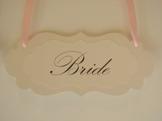
Or maybe I should skip a banner altogether, and come up with some type of fancy sign. This one definitely fits our wedding:

 This one's cute too, but I think probably everyone knows I'm the bride:

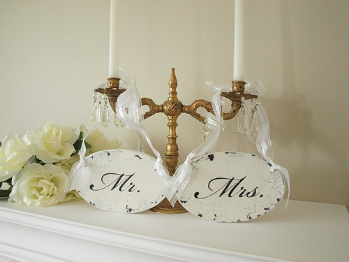
I'm also really drawn to this, but that's probably because it's surrounded by fluffy white flowers and gold candelabras, two features of our floral design:


So that's where the DIY section of my brain is hanging out lately, attempting to figure out a way to turn goofy bunting into something elegant and classic.


Did you guys use bunting and/or Mr./Mrs signs? Share some pics!


Oct 17, 2011

My Latest Wedding Obsession...

Is table settings! After our meeting with Jenny last week, I’m all about them. Putting some effort into the table design really make a difference in the look of the reception. I mean, think about it- what are your guests staring at all night? The table in front of them. I kind of can’t believe that as wedding-obsessed as I get, I never even considered this.

Oh well, now I am making up for lost time by drooling over the billion combinations you can create, mixing napkins, chargers, china, and linens. I won’t be using all, obviously, but I’m starting to gather some inspiration. I’m hoping to create an elegant look with a hint of vintage:


Although my mom is busting my chops about using these more modern chargers:

 And I love, love, love the classic, simple lines of this set up:

Anyway, I am working under some budget constraints when it comes to choosing the linens, so I have to choose carefully. Right now, I’m considering using champagne linens for the tables, ivory linen napkins, and a beautiful china plate or a charger (budget doesn’t allow for both). I’m really into these particular china patterns, both from Party Rentals LTD:
 Gold Florentine

Palais

But I’m not sure if renting china is worth the money. A charger would be a bit cheaper, and size-wise, would make more of an impact, though the china is more theme appropriate.And prettyyyyy.

Anyway, as much fun as I’m having, our florist doesn’t show us the whole look (full sample centerpieces, linen options, etc) until one month before the wedding, so I’ve got a really long time before I have to make a decision. Not that that's killing me a little bit or anything.

Did you do anything to jazz up your tables? What did you use?

Oct 10, 2011

Now We're Set

Lately I’ve been wanting to think about the detail elements of the wedding- paper, card boxes, flowers- but I’ve found myself with piles of inspiration and no cohesive theme. Cream, gold, lace, pearls, baby blue, and sapphire blurred together in my head, crippling me from getting started.

Enter Jenny Orsini, wedding planner and owner of Pampered Bride Weddings (and wedding planning superstar to me).

We didn’t have the budget for a full-on wedding planner, but my mom suggested we meet with her for her theme and décor consultation service. It was affordable, and my mom reasoned it was worth it to spend a little and solidify things now, to avoid making pricey mistakes later on. 

And I am SO glad we went. I showed up with a collection of inspiration pictures, and Jenny got my style immediately. She was super nice and came up with many ideas that I loved. She was upfront about money and honest about what would be in our decor/floral budget. She helped me to realize the design elements I really wanted were lace and pearls, and that the baby blue I was trying to make happen was just not going to work. We came up with the look for the tables, flowers, and paper products, which I’ll be posting about as I do them, but here’s a sneak preview for now:

I'm honestly still swooning

We got some good pieces of advice, which were all things I've stupidly never thought of, so I’ll share below:

  • Put some effort into the placecard table since it’s the first  thing guests see when they walk in, before the cocktail hour, and before the ceremony.  (Guess who did not once even think about this? Oh hi me).
  • Table settings are how you bring your theme to life. I had assumed linens, chargers, etc were out of our budget. She showed us how to make it work, and I am SO much more excited about things now.
  • She was able to give honest (if a little scary!) feedback on our vendors, since they were all people she was very familiar with. We may be looking for a new florist now, but we appreciated the nobullshit talk.  
  • Bridesmaids: they should never be as elegant as you (that sounds terrible in writing, I'm sorry!), and don't worry if they don't match your room decor exactly. They'll be photographed next to you, not next to your table setting. 
I’m extremely grateful to my mom for the idea to do this. We had a ton of fun planning, and now I feel so much more like I’m back in the swing of things and ready to make things happen.  

Any of you out there using a wedding planner at all? 

Jul 18, 2011

Fall Inspiration

Today's post is very indirectly in honor of BM Kelly, who got engaged last Wednesday night! Kelly has always been an amazing friend to me, and especially has been during my engagement. Despite really wanting to be engaged herself (and feeling nowhere near it), she was always incredibly supportive of everything, wanting to talk weddings for hours,  being involved, and showering me with thoughtful gifts. It definitely can be hard to find girls who can put aside their own feelings and completely support you in your happiness, and I am so, so glad to see her engaged now too! Her boyfriend totally took her (and everyone else!) by major surprise. Anyway, since she hopes for a fall of 2013 wedding, I thought I'd share some fall inspiration boards today!

For September:

Love this unusual blend of colors: fall-appropriate orange and gold mixed with pastels. It’s the perfect Indian summer vibe for a September affair.

For October: A New, Darker Brown

A fall wedding always conjures up images of browns and gold but I love the intense chocolate that adds drama to this board.  Plus, your bridesmaids will thank you- everyone looks good in an espresso shade!

For November: Dark and Fall-y

Frida Kahlo aside, this is a pretty cool board. The bold, rich color combo works great for a late November wedding.

Plus I'm seeing lots of fall stationary inspiration. This menu card and centerpiece set up would be perfect with the plum tones on the Dark and Fall-y board:

The picture below spawned an obsession with having a November wedding (vetoed by my groom  and our moms). It also started my love of cardboard colored paper, as seen in my BM cards and engagement party invites. 

Warm colors and rustic Pottery Barn style touches? Yeah, I'm in love!

Fall is my favorite season, so it’s no surprise that I have a soft spot for all things autumn when it comes to wedding planning. What’s your favorite seasonal wedding theme?

Jul 11, 2011

Americana Inspiration

At seven months into my engagement, I've made my big vendor decisions, finalized my colors and overall look, but it's still too soon to do the real detail work of bringing it to life. This, coupled with my new job and upcoming move (which I think I may have mentioned a few thousand times), means my wedding planning is in a bit of a lull for now.

So since I don't have much of my own work to share, I've decided to post some of my favorite inspiration boards randomly in themed posts over the next few weeks. It's too late for me to be changing these kinds of things (and I don't want to anyway!), but maybe I can share something that might work for someone out there. And besides, great inspiration can be appropriated for things other than weddings.  I am definitely seeing ways to work these kooky cute ideas into regular life.

I'll start with a few of my favorites that have sort of a vintage, Americana theme going on:

Kitschy Key West by Snippet & Ink

I just love the happy, sun-bleached shades here. It seems like something a casual, fun-loving couple would have for their destination wedding. It's a slightly different take on all the retro/vintage things out there, and while it's definitely kitschy, it manages to avoid being too theme-y.

Juliet by 100 Layer Cake
I have to admit that though I find this way too cartoonish for a wedding, I am still somehow really drawn to this board. I love the unexpected and bold color combo, and the way it really strongly evokes an emotion of 40s postwar travel and excitement. I'd love to adapt this theme for a 4th of July party.
(Also, I should admit that I scoured Ebay attempting to find and purchase my own copy of those bright blue aircraft prints. No luck unfortunately.)

Faded Blue Nautical by Snippet and Ink
I am completely obsessed with the nautical New England vibe of this board. It makes me wish my family wore J. Crew and went crabbing during our summers on the Cape (we don't have classy summers on a cape, we have sausage and peppers in our backyard near the Jersey shore). I love the relaxing, Atlantic, all-American look here, and the way the navy pops against the white, gray, and natural tones. I can't use this palette for my wedding, but I earmarked it for my future home. I hope Mr. B is prepared for my intense coastal decorating ideas, because this is too awesome to waste!.

Have you been able to use wedding inspiration for something non-wedding related?

Jun 27, 2011

A Jumble of STDs

So I do have some good news, my job transfer went through and Mr. B and I found an apartment!!  Lots of changes for me up ahead. It’s a blur of excitement, furniture, new job paperwork, and some not-so-minor freakouts.


But despite all this craziness, I've been trying to squeeze in some decisions on our STDs, since we want to get them out by the the end of the summer. My inspiration is all over the place: Should I do something crafty and creative? Use a photo? Coordinate them with the invite suite? (Hence my previous post on invite styles).  There’s so many options!


I initially fell in love with two really cool ideas, but nixed them both on the cost. The first were these gorgeous vintage handkerchiefs- different and elegant to me, although I think receiving a glorified snot rag in the mail may confuse people not regularly immersed in wedding blogs (so like, 95% of our guest list):


I also LOVED these vintage looking matchbooks below. The ornate gold and baby blue one fit perfectly in with our wedding style, and a matchbook is unique. Again though, they were just too expensive. Good thing, since I believe the Etsy seller no longer makes them anyway.


So now I’ve moved onto stickers. They’re functional, as guests can peel them off and pop them on the calendar, without having to look at our grinning faces on a magnet every time they open their fridge. Plus, stickers are very cost effective. Vistaprint sells a roll of 500 for around $75. Having all those extras would allow me to use them in other wedding elements for a nice cohesive look- and I like carrying a theme through.


The downside of this would be that I couldn’t just pop the sticker on its backing paper in an envelope and mail them. I’d have to come up with some kind of little info card and tie it all up in the envelope, like Mrs. Giraffe from Weddingbee did with hers:


See, the magnet goes onto that little card. Source

I love this, and the opportunity they afford to be creative, but I’m concerned that with everything else going on in life now, I might not be able to devote the time to executing it perfectly.


So the next choice is the photo postcard. It's a good way to use our engagement pics, but I’m just not in love with this, and neither is Mr. B. But it is so quick and easy to execute, all we'd have to do is stop by Minted or whatever and upload a picture.


Finally, I love the look of an STD that coordinates with the whole invite suite though, even if it is the simplest option. Of course, that means we have to choose invites now, which I’m not sure we’re prepared to do.
These Martha Stewart for Crane "Crown" invites are the closest copy I can find to the ones I posted last week. Unfortunately they still aren't cheap, and they're lacking that awesome gold border.

What do you guys think? Something different like a sticker, something that matches, or a good ol’ photo card? Leave some links to your STDs on your blogs if you want!


Apr 25, 2011

Tone of the Wedding

So now that I’ve talked about my imaginary wedding, and shared the engagement party invites  that will look nothing like the rest of the wedding stationary, maybe it’s time to discuss our actual wedding. Honestly, it’s a pretty formal, traditional affair, starting with an interfaith religious ceremony and continuing on to a ballroom reception. Here's my inspiration board, the starting point for our wedding designs:

I surveyed some people on one of the Bee boards and got some great descriptors for this board- my favorite being "champagne and romance!" (Suggested, I think, by Sandy Toes Bride.)

Our Color Palette
Hopefully your monitor doesn't make these colors look too strange. I love this color palette, but hate that four months after deciding on it, I’m suddenly seeing it in every wedding magazine out there! I didn’t want to be trendy and I hope it won’t be dated by next year!).

Style Description

Classic:
I want us to look back and still love the details of our wedding years from now. The ivory and gold in our color scheme is very timeless to me. Our wedding is a formal ballroom event with a band, and skips a lot of trends like letterpressed invites, cupcake towers, or candy buffets. Of course, the class factor may be tempered slightly by the fact that we'll be running Weezer's Pinkerton album straight through dinner, and offering up a signature beer, but we need some personality in there!

Elegant:
To me, elegant means tasteful, luxurious, refined- basically knowing when there’s too much going on. I’ll be passing on the chains of dripping crystal and shiny rental linens, or gigantic overstuffed floral arrangements. We'll keep things beautiful but restrained. Like these invites, which are both classic and elegant:
I am so in love with these! Too bad they are WAY out of my budget! Source

Romantic:
This is where the sky blue accent comes into play, adding a dreamy, refreshing, and slightly unexpected touch. Our gilded décor and chairs will be complemented by lush and girly peonies and hydrangeas, as well as warm amber lighting. Something about the image below really captures the refreshing, romantic feel for me:
The original inspiration for our color palette. Source

Opulent:
Our venue is really what brings in the opulence. It’s designed to look like the Palace of Versaille, and it features a beautiful, huge ballroom with 36’ ceilings, a Juliet balcony, and a spiral staircase. Plus, it’s got an over the top feast for a menu- the cocktail hour alone features over 30 passed hors d’ouevres and stations, and a decadent Viennese display for dessert.

I'm loving the opulent gold in this picture of the Palace of Versailles, which our venue was designed after! Source

What words do you want associated with your weddings?

Apr 14, 2011

My Hipster Wedding

Most brides choose a theme or color scheme for their wedding and stick with it, and I am no exception.  But just because you’ve chosen navy and white for your casual seaside reception, doesn’t mean you're not occasionally captivated by an elegant engraved invitation suite, or an Old Hollywood venue.

I’m no different. Due to the climate and weather where I live, the dreamy “Style Me Pretty” rustic blog weddings are impossible for me. (Not that those are realistic for any human to execute without copious professional styling).  So we’re having an indoor event, in an elegant and classic ballroom. It suits our style and personalities perfectly.

But if I lived in Southern California, maybe I’d be a little more laid back and casual, and boy would my wedding look totally different! I call my imaginary wedding my “hipster wedding,” since it’s the opposite of the traditional affair we’re having (and therefore, in my mind, hipster-y).  My fake wedding has some great characteristics:

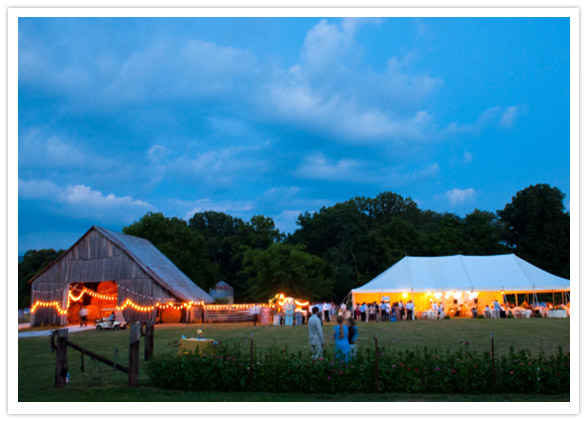
It would definitely take place in a tent. In real life, that's too many vendor coordination headaches for me. But I do I love these late night tent shots, where the world looks distant and cold, except for the warmth coming from the wedding tent.


Besides, look how pretty and fresh a tent wedding looks if you do it in the daytime:
Love it! Source
 

Jan 16, 2011

Inspiration Board

I never understood the point of inspiration boards, and never planned on making one. Until I was bored one night and threw one together as a background project while I was G-chatting Mr. B. He was arguing that my dream colors (ivory and gold) would be boring, and I wanted to show him they woudn't be. I wasn't even paying much attention while I did it, just combining some favorite pictures I'd saved. But when it was finished, I was shocked at how much I loved it. I mean, loved. I probably should have figured this, I combined all of my favorite wedding pictures into one big collage- why wouldn't I love it?

But more than that, I was glad I made it. First off, I was surprised to see how many cohesive elements it had. It made me feel like I could trust my judgment, that I gravitated towards certain things because they shared a common style element. What I like/choose is subconscious, but since it all comes from me, it somehow all works together.

Secondly, I learned my colors were a bit different than I'd always envisioned. I was very adamant about "ONLY gold and ivory, absolutely NO color"- well look how much baby blue is in here! (FYI, if asked before this board, I would have told you that baby blue was my least favorite color). I was glad that popped up as an accent color, since a lack of color was a small point of contention between Mr. B and me.

Finally, it's an easy way to show people what I'm thinking. Saying "white and gold with baby blue accents" could mean anything. This clarifies it a lot, and classes it up a bit. So without further ado: the board!


I love this board. I think it is elegant, classic, beautiful, vintage, and vaguely regal, yet retains a refreshing feel. I'm so glad I made this, and recommend everyone else try it out as well. You will be surprised at what you learn!