
Mr. B’s parents love to have parties, and they’ve decided to throw one for our engagement. They’re hosting a backyard pool party for us at their house, so it’ll be a pretty relaxed and casual atmosphere (hope FMIL knows relaxed and casual means beer pong!) To reflect this, I decided to design some party invites with a vintage and fun feel. The look was heavily inspired by the menu at Brooklyn Bowl, a great bowling alley/bar in Williamsburg:

My design, after the jump:

Looks better with our actual information in, but oh well!
The design process has three major steps: First, decide your wording (if you realize you have to change text later, it can throw off your entire project), then choose an invite size (I went 4 x 6), and then just play around with the font, character spacing, and text sizes till you're happy. It’s a trial and error process, but I do have a few tips:
- Use a different font or bigger size to highlight “priority” info, like the date or time of the party.
- Make each line on the invite a separate text box, and keep them the same width, varying only the height based on font size.
- Character spacing is how you will get a line of Size 14 font to be the same width as a line of Size 36 font. To adjust that, highlight the text, right click and choose “Font,” then select the “Character Spacing” tab. Choose “Expand” from the drop down menu, and adjust the spacing accordingly- it will take some experimentation! Some lines will need to be expanded by 1 point, while others might need to go as big as 8 in order to line up.
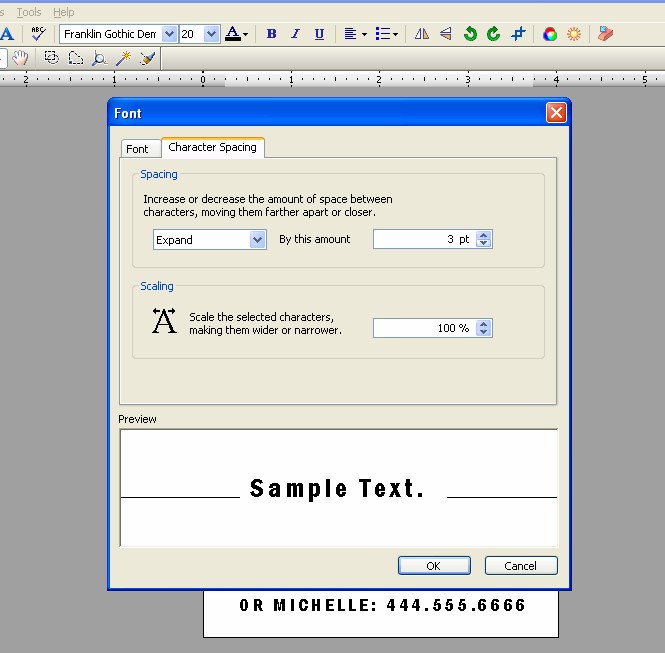
Character spacing window screen shot
- Save your file as a JPEG to preserve font integrity when printing.
Mr. B really likes this design, so I'm happy about that. I did experiment with tiki style fonts to really bring the pool party idea home (Mr. B vetoed), as well as different background colors. But I am boring and liked good old black and white best.
We had these printed at Staples, mounted them on Paper Bag cardstock from Paper Source, and used a black chalk ink pad to color the edges and add a vintage look.
Fonts used are Franklin Gothic Demi Cond, standard in Word 2007, and Budmo Jiggler (the polka dot font), available for free download from http://www.dafont.com/.
Wow... that looks great! Thanks for the tip on saving it as a jpeg!
ReplyDelete